728x90
반응형
SMALL
파일 불러오기
import pandas as pd
import matplotlib.pyplot as plt

plt.rcParams["font.family"] = "Malgun Gothic"
graph = pd.read_excel("test_data.xlsx", sheet_name = "Sheet1")

graph.head(10)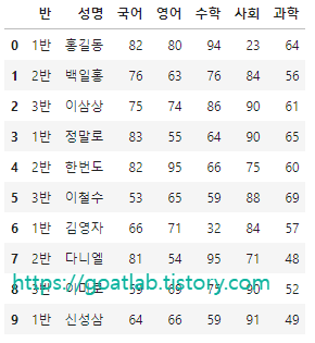
선 그래프
graph.plot(y = ["국어", "영어", "수학"], grid = True, title = "선그래프", color = ["green", "red", "blue"])

plt.show()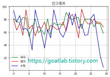
산점도 그래프
graph.plot.scatter(x = "반", y = "영어", color = "red", title = "영어 점수 산점도")

plt.show()
막대 그래프 (수직 막대)
graph.iloc[ : , 2:7].mean().plot.bar(grid = True, title = "과목별 평균점수", color = "orange", ylabel = "평균") # 2~6열 평균을 구한 후 막대그래프 그리기

plt.show()
막대 그래프 (수평 막대)
a = graph.iloc[ : , 2:7].mean().plot.barh(grid = True, color = "blue")
a.set_xlabel("평균")
a.set_title("과목별 평균점수")

plt.show()
원 그래프
# 반별 인원수 카운트해서 class_c에 저장
class_c = graph.groupby("반").size()
class_c.plot.pie(title = "반별 인원수 분포", ylabel = "반", autopct = '%1.1f%%', explode = (0.1, 0, 0), shadow = True)

plt.show()
히스토그램 (단일)
a = graph["영어"].plot.hist(bins = 20, color = "lightblue", edgecolor = "green", grid = True, title = "히스토그램")
a.set_xlabel("영어점수"), a.set_ylabel("빈도수")

plt.show()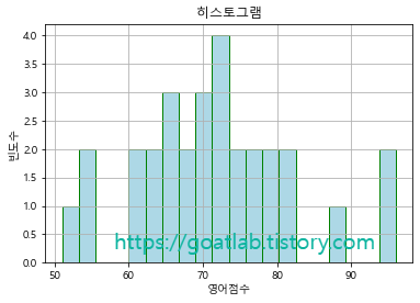
히스토그램 (중첩)
# 사회, 과학 점수 분포 시각화
graph["사회"].plot.hist(bins = 20, color = "blue", edgecolor = "blue", alpha = 0.5, title = "히스토그램")
graph["과학"].plot.hist(bins = 20, color = "red", edgecolor = "red", alpha = 0.5, grid = True)

plt.show()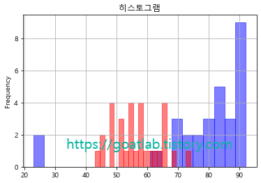
상자 수염 그래프
graph.boxplot(column = ["국어"], by = "반")

plt.show()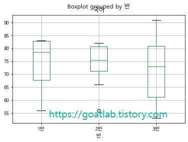
728x90
반응형
LIST
'Data-driven Methodology > DS (Data Science)' 카테고리의 다른 글
| [Data Science] 결측치 처리 (2) (0) | 2022.09.26 |
|---|---|
| [Data Science] 결측치 처리 (1) (0) | 2022.09.24 |
| [Data Science] 데이터 시각화 (3) (0) | 2022.09.22 |
| [Data Science] 데이터 시각화 (2) (0) | 2022.09.22 |
| [Data Science] 데이터 시각화 (1) (0) | 2022.09.22 |


