Programming/Python
[Python] Dash : 데이터 시각화
goatlab
2024. 7. 10. 13:57
728x90
반응형
SMALL
라이브러리 설치
!pip install dash jupyter-dash dash-bootstrap-components
데이터 로드
import pandas as pd
import plotly.express as px
from dash import Dash, dcc, html, Input, Output
import dash_bootstrap_components as dbc

df = pd.read_csv('https://raw.githubusercontent.com/datasciencedojo/datasets/master/titanic.csv')
num_features = df.select_dtypes(include='number').columns
df.head()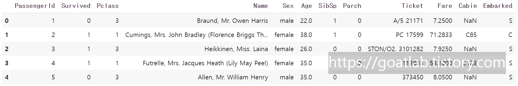
main
# dash app 초기화
app = Dash(__name__, external_stylesheets=[dbc.themes.BOOTSTRAP])

app.layout = dbc.Container([
    dbc.Row([
        dbc.Col([
            html.H1("Titanic Dashboard"),
            dcc.Dropdown(
                id='survived-dropdown',
                options=[
                    {'label': 'Survived', 'value': 1},
                    {'label': 'Not Survived', 'value': 0}
                ],
                value=1,
                clearable=False,
                style={"width": "50%"}
            ),
            dcc.Dropdown(
                id='feature-dropdown',
                options=[{'label': feature, 'value': feature} for feature in num_features],
                value='Fare',
                clearable=False,
                style={"width": "50%"}
            ),
            dcc.Graph(id='scatter-plot')
        ], width=12)
    ])
], fluid=True)

@app.callback(
    Output('scatter-plot', 'figure'),
    [Input('survived-dropdown', 'value'), Input('feature-dropdown', 'value')]
)

def update_figure(survived_value, feature_value):
    filtered_df = df[df['Survived'] == survived_value]
    fig = px.scatter(filtered_df, x='Age', y=feature_value, color='Pclass', title=f'Survived = {survived_value}, Feature = {feature_value}')
    return fig

if __name__ == '__main__':
    app.run_server(debug=True)
728x90
반응형
LIST